Page 1 of 1
Posted: 23 Jan 2016, 08:13
zagames
Well, I finally got a replacement computer and have started fixing scripts in RVZ. I have heard quite a few complaints about the interface of the website as well. Does anyone have suggestions? We can improve the existing or start completely fresh with a new format/layout. If you find layouts you already like, just link them here. Also feel free to post drawings or sketched of your preferred look. Try to find something that will work well with Re-Volt and it's content. Thanks for the help!
Zach
P.S. - There is already a thread for RVZ suggestions not related to this one. Please post any non-layout suggestions there.

Posted: 23 Jan 2016, 10:09
Abc
Please return to old RVZT, it was fine! you fixed a website that didnt need to be fixed (no offense)
Posted: 23 Jan 2016, 10:52
zagames
I wish it were that easy... When we had to move servers, we were forced to update the systems in order to maintain compatibility.
Posted: 23 Jan 2016, 14:42
Kipy
I think they mentioned everything there.
I personally miss REAL ranking system

+ I can imagine a 'search by track type' (classic, lego, extreme) and of course I miss a track type, this is
lego extreme which disappeared when RVZT become RVZ.
Posted: 23 Jan 2016, 16:08
Manmountain
I dont like the auto download while using chrome, I would prefer to select my folder destination as it use to be,
Posted: 23 Jan 2016, 18:32
VaiDuX461
Manmountain @ 23 Jan 2016, 12:38 PM wrote:I dont like the auto download while using chrome, I would prefer to select my folder destination as it use to be,
It is a browser related thing, isn't it?

Check Chrome settings. I don't have it, so look online for help to disable auto download.
Posted: 23 Jan 2016, 22:36
zagames
Yes MM, that is a Chrome setting. In my version, I go to the 3 bars button at the top right of my browser, click on Settings from the drop down menu, and at the bottom of that page, Advanced Settings. There is a checkbox to Ask Each Time.
Perhaps I wasn't clear. This post is intended to design a new look for the site since some are unhappy with it. I need ideas like this Google search:
https://www.google.com/search?q=web+gam ... COoQsAQIGw
Posted: 23 Jan 2016, 23:22
MarvTheM
Middle click for opening pages in a new tab doesn't really work. It opens a new tab and still navigates to the page.
I think the layout looks good as it is. I never liked the style sheets but so far it is very functional. Something close to the Re-Volt menu would be cool, too (like on
re-volt.me)
Posted: 24 Jan 2016, 00:09
Manmountain
OK, my mistake.

Posted: 24 Jan 2016, 03:04
Allan1
I personaly liked the current RVZ layout. It's organized and good looking. I just missed some things that were removed in the RVZT transition. And also, there's some that would be nice to be added IMO. These are my suggestions:
1.Show at the voting section how much votes the car or track received (as it was in the RVZT style)
2.Add "number of times downloaded" at Refine Search, and also add something like "search by category" (as Kipy already mentioned), as well as return with the Classic and lego Extreme categories.
3.Add a "reply" button in the comments
4.Increase the upload size limit (for tracks with bitmaps larger than 512 pixels (.bmo, .bmn...))
5.Add a "lenght counter" for the reversed way of tracks, and/or fix the current counter, which is showing the reversed lenght instead of the normal one.
Edit:
P.S. - There is already a thread for RVZ suggestions not related to this one. Please post any non-layout suggestions there.
Oops... Sorry, my bad. I didn't noticed that

Posted: 24 Jan 2016, 05:32
Phantom
So this thread is only about layout suggestions? Hmm.. what's the problem with it?
When I saw this thread's title I thought you were looking for recommendations about the site functionalities or about its flaws and defects, which is what the users have been complaining about on and on since the site's release. I think Vaid can give a really detailed analysis about the site's current flaws (from the mods' point of view). We've talked about it and I like his perspective.
I don't have much to say about the layout itself if by layout you mean the graphics and stuff and the placement of buttons. I think it's cool as it is. Something like revolt.me is too minimalistic I think, but that has always been Marv's style so I respect it. I'd like to know your point of view, why would you consider it needs a change? What kind of suggestions are you looking for? Style sheets only?
Posted: 24 Jan 2016, 09:41
Gotolei
Yeah, the layout does its job well enough as-is imho. Quite frankly, in my experience it's less the layout and css that I have trouble with and more the functionality of the site itself.
Fixing stuff like the top-left logo not linking to the front page and "sort by ___" being effectively random would go much further than just piling on bloat and shiny things.
Posted: 24 Jan 2016, 15:53
Phantom
Making changes to the layout won't change the current situation of the site. The layout isn't RVZ's biggest flaw, it's the features. There are many things to be done about its functionalities. I'll write them down in the other thread to respect the original post.
If anything had to be done about the
aesthetics the only things for me would be getting rid of the combination of round edges with square edges, alligning certain options and fixing the borders.
Click to see descriptive image.
Nothing else to say about the eye-candy stuff.
Posted: 13 Feb 2016, 07:50
Phantom
I am still curious about what the purpose of this thread is and if we're going to see changes this year. Zach my only worry is that we're planning to make a big move to attract new members but with the current system I'm not sure how many are going to survive the registration process.
Posted: 18 Feb 2016, 03:14
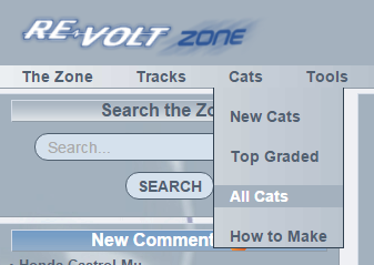
MarvTheM
We need this.
Posted: 18 Feb 2016, 20:24
Hot Violet
^
Nice. There's always room on the interwebs for more cats.

I quite like the way RVZ is laid out. I've changed the style to Darkness as the bright ones tend to strain my eyes and I'm a sucker for the dark and 'sophisticated look.
The only things I would change is in the leftmost menu (The Zone) the first link titled Timeline is a bit strange. It would be clearer if named Home or something to that effect. The other thing I would change, which is purely aesthetic and a personal thing on this end, is the title banner (on the Darkness theme). The traffic cones look like a "Page Under Construction" placeholder image. I do like how the coloured cones pop out from the darker background. The title banner on the default style could do with some 'pop' too. Perhaps something similar to the RV Live logo but in the same colour as the game logo. That way the red would jump out on that style too. Hope that doesn't sound too cheeky.