Page 1 of 1
Posted: 26 Mar 2015, 08:05
jigebren
Great update of the board skin!
Thanks to everyone for letting this forum so quiet it provided very good working conditions.

No thanks at all to the invisionfree staff for the ridiculously inconsistent classes layout they built, making these forums a real pain to skin.

Big thanks to Mozilla for providing such efficient integrated tools for web developing.

I have definitively not checked everything so let me know if you notice blatant glitch. Just for info, obsolete browsers are not supported (so if that the reason it looks weird for you, do yourself a favor and update your browser instead).
If you're using Firefox (and Safari), you should now be able to see the topic title even when scrolling down the page.

Posted: 26 Mar 2015, 17:58
Abc
omfg, i have to really say it, now it looks less dull but a touch of high contrast theme, nice change for threads but not a really good one for forum browser, sorry.
(best critic i ever had done)
Posted: 26 Mar 2015, 19:03
Alphacraft
I really like this new look! The latest discussions box looks much better with lines separating the different threads. The whole forum exudes a sense of professionalism, but maybe that's just my imagination

My only complaint about the new skin is the big blue Posted box on every thread. It looks jarring and out of place, IMO. Otherwise, great job Jig!
Posted: 26 Mar 2015, 19:26
VaiDuX461
Design is
 It seems that link text color and signature text color are the same. I think this was for a while now, not sure.
@Jig: Btw, 'Delete' text in the button has a little space on the right side.
Alphacraft @ 26 Mar 2015, 03:33 PM wrote:My only complaint about the new skin is the big blue Posted box on every thread. It looks jarring and out of place, IMO.
I can understand why this was done with "Posted:" box. You see, that field can be actually clicked on like any normal button. It gives you a direct post link for sharing somewhere else.
As it "kinda" acts like other 'edit', 'quote', etc. buttons, he used same design, I guess.
Also, it's easier to know that you can actually click on it (as the cursor doesn't change for some reason). I learned about this "hidden button" only few weeks ago

Posted: 26 Mar 2015, 20:18
Alphacraft
Ah, ok, I was wondering how to do that myself now I know
Carry on.
Posted: 26 Mar 2015, 21:58
Citywalker
It really is kinda easier on the eyes. Thanks.
Posted: 26 Mar 2015, 22:02
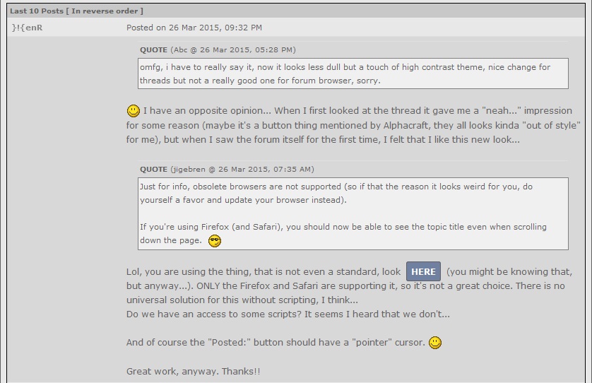
}!{enR
Abc @ 26 Mar 2015, 05:28 PM wrote:omfg, i have to really say it, now it looks less dull but a touch of high contrast theme, nice change for threads but not a really good one for forum browser, sorry.
I have an opposite opinion... When I first looked at the thread it gave me a "neah..." impression for some reason (maybe it's a button thing mentioned by Alphacraft, they all looks kinda "out of style" for me), but when I saw the forum itself for the first time, I felt that I like this new look...
jigebren @ 26 Mar 2015, 07:35 AM wrote:Just for info, obsolete browsers are not supported (so if that the reason it looks weird for you, do yourself a favor and update your browser instead).
If you're using Firefox (and Safari), you should now be able to see the topic title even when scrolling down the page.
Lol, you are using the thing, that is not even a standard, look
here (you might be knowing that, but anyway...). ONLY the Firefox and Safari are supporting it, so it's not a great choice. There is no universal solution for this without scripting, I think...
Do we have an access to some scripts? It seems I heard that we don't...
And of course the "Posted:" button should have a "pointer" cursor.
Great work, anyway. Thanks!!
EDIT:
Seems like I got what is definitely feeling wrong with the thread design.
The headers of a (sub-)forums have a bottom-looking shadow, while the posts themselves are having some sort of top-looking shadow...
Micro-edit: I found the wrong rule!
If you disable the "
border-top" rule at the "
div.tableborder tr" section, posts start looking a way better, and it also fixes a small white line glitch at the top of a quote...
Micro-edit 2: It changes a look of a forum itself. Don't know if in better way or not... probably in better. Please, take a look at this yourself.
[HIDE=Screenshot from Edit mode]
[/HIDE]WOW, is that's an intended behavior?? Well, it actually helps to see the links, but the button is quite big...
Citywalker @ 26 Mar 2015, 09:28 PM wrote:It really is kinda easier on the eyes. Thanks.
It's not easier on my eyes...
EDIT 2:
[HIDE=At the bottom of a thread]
[/HIDE]Don't know if it can be considered as a bug, but the buttons are getting cropped out...
Posted: 27 Mar 2015, 01:10
jigebren
Hey, thanks... Most (all?) reported issues should have been fixed now.
I've also fixed everything I noticed so far (except maybe a few glitches that are not really worth it).
Posted: 27 Mar 2015, 03:45
Alphacraft
Ah, the Posted button looks much better, thanks Jig
Posted: 28 Mar 2015, 13:15
Pyves
Thanks, the skin update really looks nice !
Posted: 28 Mar 2015, 13:51
Gotolei
Massive props for this. It's nice to see an update that actually improves things
Buttons aren't too out of place (and look vastly better than the old web 2.0 ones, though there's still some of the icons lingering in the submenu), subtle gradients and shadows here and there touch it up nicely without getting in the way.
Only thing that kinda bugs me is the general lack of vertical dividers.
Also - and this is
really stretching it - perhaps the blue squares denoting member group could be changed to have the same shade of blue as the buttons?
E: one more thing - the Topic Options toggle looks a bit out of place with its one-letter label, especially since it doesn't have the horizontal spacing that all the other buttons do.
E2: were things improved code-wise as well? I don't recall posting being this snappy

Posted: 22 Apr 2015, 20:43
Abc
[HIDE={Chrome} The Helll happened!?


]

[/HIDE]
Posted: 02 May 2015, 11:50
Abc
Same thing again; Fix please? it's not pretty to have a "fat cell". Topic title is a bit too large and last action is a bit too short....
[HIDE]

Excuse my 60 tabs, my bookmarks = live tabs
lolglitch in preview

[/HIDE]
Posted: 04 Jun 2015, 16:03
Abc
Now last posts page is out of place :/
[HIDE]

[/HIDE]
Posted: 04 Jun 2015, 19:25
VaiDuX461
Abc @ 4 Jun 2015, 01:33 PM wrote:Now last posts page is out of place :/
No problem here, never experienced something like that.
Firefox 38.0.5
Posted: 09 Aug 2015, 06:53
Abc
either its fixed or its a rare issue. idk, i mainly use firefox nightly.
Posted: 09 Aug 2015, 14:28
VaiDuX461
Abc @ 9 Aug 2015, 04:23 AM wrote:i mainly use firefox nightly.
That's the main point. You shouldn't report a problem here if you use an unstable web browser.
Few days ago, I've tried latest ffox nightly build, and I must say it was sh!t. Uses less memory, but become much,
much slower. Disappointing build? Probably
Posted: 10 Aug 2015, 01:08
Abc
you probably caught a bad build, also remember it uses e10s (chome-like proceses)
nightly is basically standard firefox, it's not a big change but weird stuff happen eventually, just having a bleeding edge build doesnt mean all the problems are rooted there, the glitch happened in chrome also (when i was using it)
you can always disable that experimental feature, browser.tabs.remote.autostart config, theres a commandline also
e10s on Mozilla Wiki.
Posted: 10 Aug 2015, 15:25
nevermind
Abc @ 9 Aug 2015, 09:38 PM wrote:nightly is basically standard firefox
lol
Posted: 17 Oct 2015, 17:06
}!{enR
Hey jigebren, looks like you recently messed up something on the board. Board logos everywhere instead of post count bar's bluish squares, and they appear instead of rolleyes emoticon...
[Vaid]: invisionfree server problems I assume.
Posted: 27 Oct 2015, 06:50
Abc
why now it reads "Welcome back; " ? (it should say "Welcome back <membername>)
Posted: 24 Nov 2015, 02:25
Abc
The extra stuff takes a while to load when on a slow connection, i suggest leaving the "legacy" navigation bar.
Posted: 11 May 2016, 03:17
Abc
the link in the bottom of the reply page opens a popup window in 127.0.0.1 instead of the forum
example on this page:
Code: Select all
[QUOTE=link contains]javascript:PopUp('index.php?act=ST&f=2&t=2068','TopicSummary',700,450,1,1)[/QUOTE]
and displays:

PS: uhhhhhh, whats up with the tags and the forum is sort of unusable without these "extras" (HIDE doesnt load either)
Posted: 04 Sep 2016, 01:43
Huki
Lists don't work for some reason.
I typed this:
Code: Select all
[LIST]
[*]Item 1
[*]Item 2
[/LIST]
The result:
The list simply gets removed.
Firefox 48 on Xubuntu.
Anyone else with this problem? (simply create a new reply, add a list, and use Preview Post).
Update:
Lists are working again.
Posted: 04 Sep 2016, 03:27
VaiDuX461
List tag does not work indeed. Removes everything what is inside after previewing or posting.
Firefox 48
Posted: 03 Nov 2017, 04:42
Abc
Login does not persist across pages if Remember me is not used at least on icognito